Pleased to meet you
Hi, My name is Tim Putt and I am a graphic designer. After 8 years in the industry I've learned more than simple pixel pushing. Creating great work requires a thorough process for discovery, a passion to learn new things and a drive for technical excellence.
Building relationships and maximizing visual impact inspire me to get up every morning (that, my wife and two small children of course). I'd love to have a converstaion with you about possible collaborations. Contact me through the form—or give me a call 321-230-8465.
Resumé
The Portfolio
Shown here is a sampling of work that I've had the opportunity to create. Some in part as collaboration and others in there entirety.View the work but selecting a project icon on the right or by selecting a project number in the navigation. The "next" and "previous" buttons can be used to see more from each project.


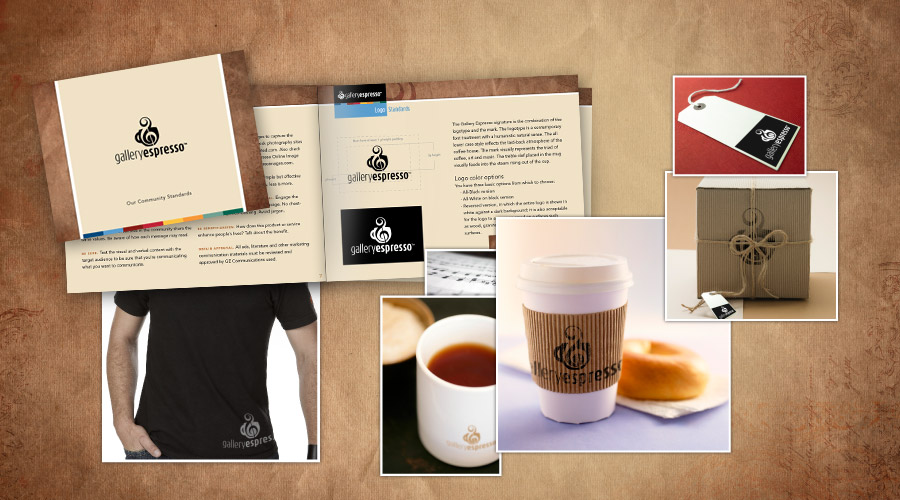
Gallery Espresso
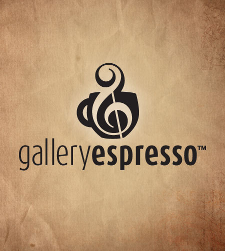
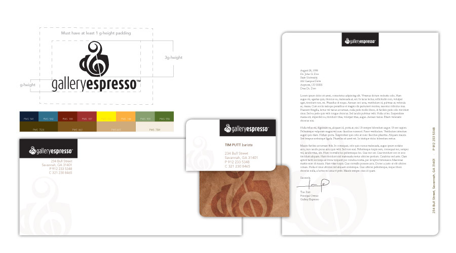
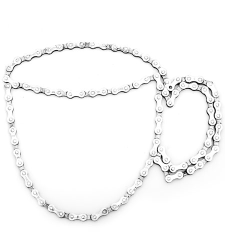
Logo with Identity Guide, 2009Gallery Espresso — a uniquely positioned coffee house in Savannah, Georgia caters to a community of coffee lovers, musicians and artists — decided that other markets would benefit from franchise expansion. A complete brand redesign was assigned.
In order to create a cohesive brand with the strength to compete in national markets, an entire visual assessment was required. Gallery Espresso needed to be intentional in their image branding at every juncture starting with the logo and storefront right down to napkins and mugs. The concept of melding the arts with the coffee house experience was the central theme and design driver. Following a thorough process of logo development, it was applied to each area where Gallery Espresso would have opportunity to brand themselves. The final products were gathered into an identity ebrochure to be shared electronically.
The following designs are elements from the ebrochure, starting with the logo shown here.
Gallery Espresso 2
Gallery Espresso 3
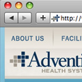
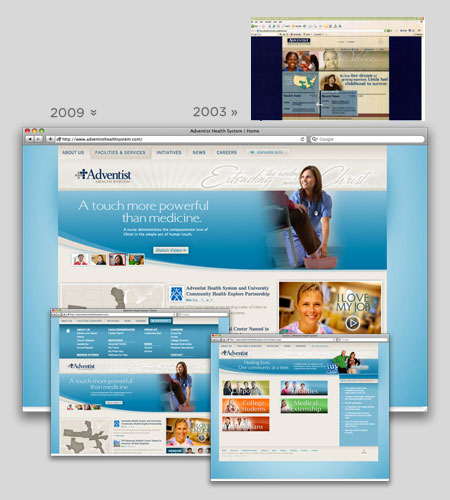
Website Redesign, Adventist Health System
Print, 2009AdventistHealthSystem.com was in need of a complete overhaul after being neglected for 6 years. The organization of content was a major task which needed to reflect marketing strategies and attitudes which had changed since the first launch. New focus and ownership of content determined to keep the Christian mission focus using news stories front and center in the new design. In addition, careers took a new dominance on the home page. This correlation was a response to the analytics which recognized current interest in these areas of the site to be more popular.
The redesign used the newly adopted branding strategy of Adventist Health System. The image styling, colors and typefaces selected here were also used in subsequent marketing and trade show graphics to ensure a unified visual style. New elements to the home page include video content, a drop-down site map and a flash-based facility locator.
Portfolio 1

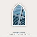
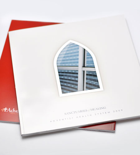
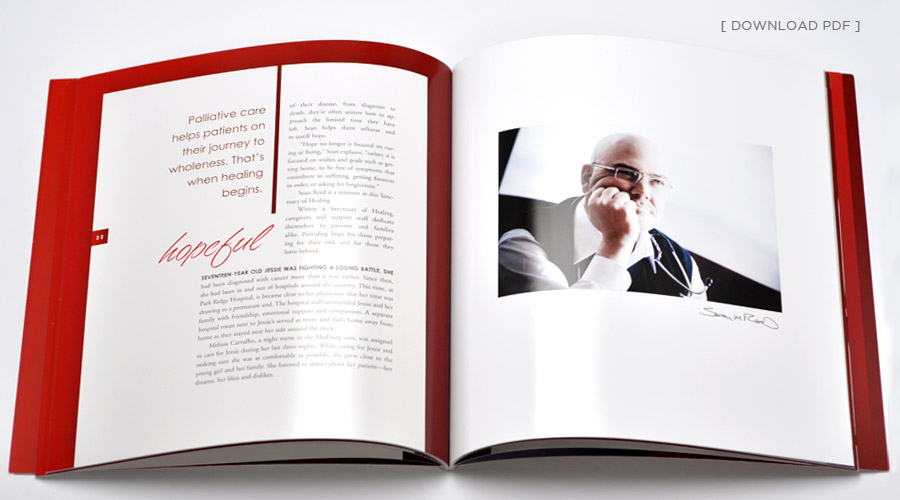
Annual Report, Adventist Health System
Print, 2009Each year Adventist Health System uses its annual report to highlight and feature the success of the hospital system as well as the care and compassion of its caregivers. Sanctuaries of Healing uses architectural photography of the facilities with photographs of highlighted employees who go beyond their duty to make the hospital a true healing environment. These individuals and their stories a represent what Adventist Health System stands for.
My role as designer:
This project relied on collaboration between the client, photographer, writer, editors and designer. Conceptual decisions regarding the direction of the book were discussed and made together. As graphic designer, I analyzed and selected final photography, executed typographical and color scheme decisions and arranged each page to flow, smoothly integrating content and concept. I was designer, photo editor, production artist and press liaison for the project and also made key decisions on paper, embossing and finish.
Adventist Health System Annual Report
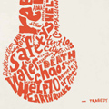
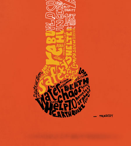
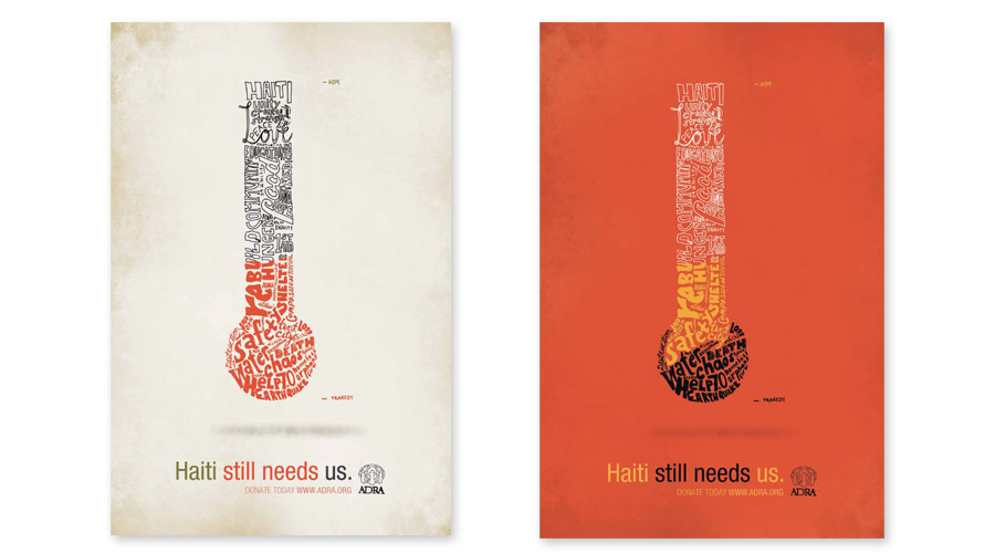
Haiti Relief Poster
Print, 2010ADRA (Adventist Development and Relief Agency) is a humanitarian agency operated by the Seventh-day Adventist Church for the purpose of providing individual and community development and disaster relief.
The intent was to create a poster targeting affluent professionals who may not have the time to volunteer, but do have the means to donate. While many agencies use photography to pull on the heart strings of donors, the audience has seen it all before and needs a unique approach.
ADRA uses imagery and texture to communicate in their usual promotional materials. By using type and texture maximum impact and focus will be placed on the message and contextual meaning shared through the design. The visuals stand out to traditional donors as an unexpected, but refreshing style.
My role as designer:
I developed the concept and created each piece of the artwork. After conversations with ADRA, they have decided to print the poster in their next campaign and offer it as a download to their affiliate international agencies as well as re-purpose it to be used on shirts and at conventions.
Haiti Relief Poster
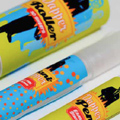
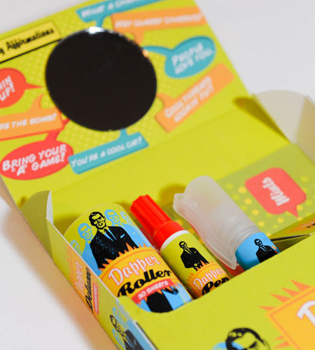
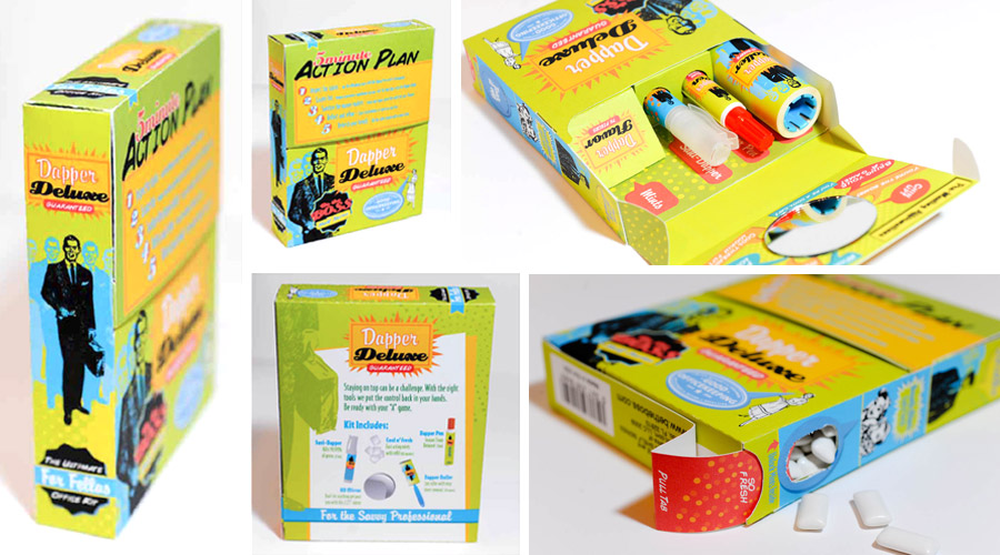
Dapper Deluxe Product
Print Packaging, 2009
The assignment for this project was to develop a product design for three related items that could be sold in a kit. The result is this—a tidy/freshen-up kit for men who work in an office setting, presented in a fun and playful way. It creates a unique brand identity that has potential to be developed even further into a series of products.
The concept behind this product acknowledges the lack of acceptable, man-friendly hygiene products available for the office setting. Dapper Deluxe creates and occupies that market segment alone. The graphic treatment appeals to a younger office demographic but is able to reach to a wider audience in part to the retro graphics and their cross-generational appeal. The kit was developed to sit on a an office shelf or fit in a drawer. It could be purchased for oneself or make a great “first-job” sort of gift.
The kit includes a lint roller, a stain-remover pen, spray disinfectant, chewing gum and a mirror.
Haiti Relief Poster
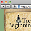
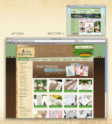
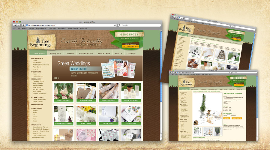
Tree Beginnings Redesign
Medium: Website, 2009Tree Beginnings is an online store providing eco friendly favors and gifts. The main clientele consists of bridal couples looking for small gifts to give their wedding guests but also include other special occasions. The visual driver for the redesign was “back to the earth.” It was important to create the look of a 2.0 site which provides important trust indicators while maintaining the home-owned and eco friendly look as well.
Several goals that contributed to the site redesign were:
- to create a consistent look and feel to be applied throughout the web experience
- to reorganize the navigation to simplify the selections as well as top-level hierarchy
- reduce the amount of unnecessary clutter on each page
- create a flash-based showcase to promote current “hot items”
- reutilize the flash-based video in a way that gives it more visual prominence
- improve search engine results for eco keyword searches
In a nutshell—to reinforce user trust, improve efficiency and proclaim earth friendliness.
*No response from the client was heard since the redesign was offered free of charge.
Tree Beginnings
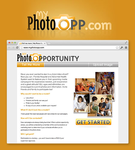
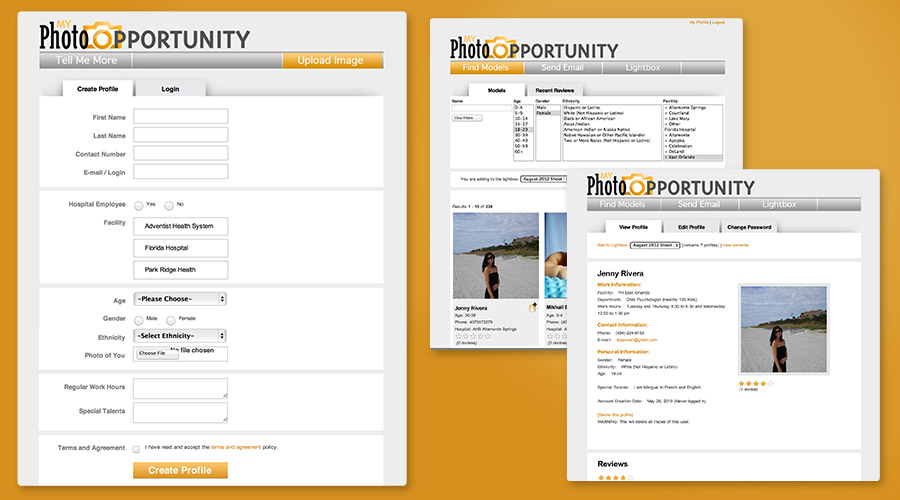
Internal Talent Recruitment Website
Website, 2012My Photo Opportunity allows employees, friends and anyone interested in participating in system photo and video campaigns a chance to be selected. The user interface is one page long allowing them to register and update their information. The model searchers have a robust AJAX system that live updates as filters are applied. Talent searchers can use a lightbox to collect possible individuals and then use contact them all using an integrated email system. After talent are used, a model review is provided for future searchers of talent.
This concept was a pet project of my own after hearing over and over again when visiting facitlities of people interested in particiapting in photo and video work. I took this project from the idea stage through full design mockup and implementation. I worked with a developer to accomplish the task.
My Photo Opp
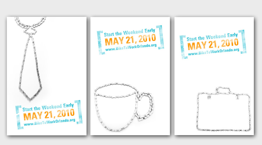
Bike to Work Series
Print, 2010This poster was designed to promote the “Bike to Work Day” in Orlando, FL. Another one of the goals of this poster was to remind viewers of the benefit of cycling to work and to keep it in mind as a healthy alternative.
One specification of this assignment was to use original photography as the key element within the design. Simplicity in composition was intentional to assist in balancing a conceptually dynamic poster series. The posters are direct and visually intriguing.
Bike to Work Poster
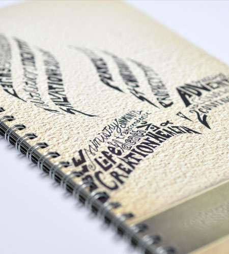
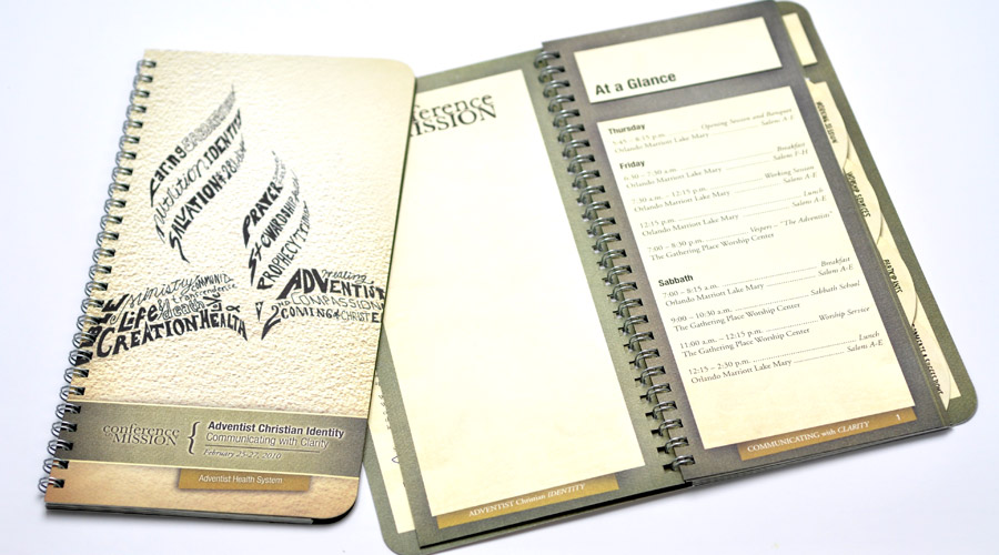
Conference Booklet
Print Package, 2010Each year Adventist Health System holds a conference for hospital and church delegates to discuss the topic of mission within the organization. In 2010 the discussion focused on what it meant to be a Seventh-Day Adventist organization and how that mission should be best demonstrated and reflected in business practices and patient care.
The introspective focus of the conference drove each element of the design. The cover uses words, phrases, beliefs and associations of the faith to create the Adventist logo mark. The paper stock and visual texture applied throughout the conference booklet reminds the reader of the heritage and roots of the church and the legacy that they too will leave future generations. Classic typefaces were selected to reflect the timeless foundations of principle and belief. Hand-written accents were used throughout the booklet to humanize the piece more directly. The concept was well-received as determined by the numerous unsolicited comments of appreciation and applause.
Haiti Relief Poster
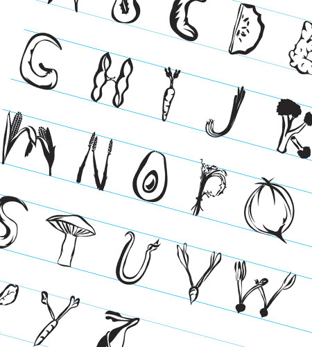
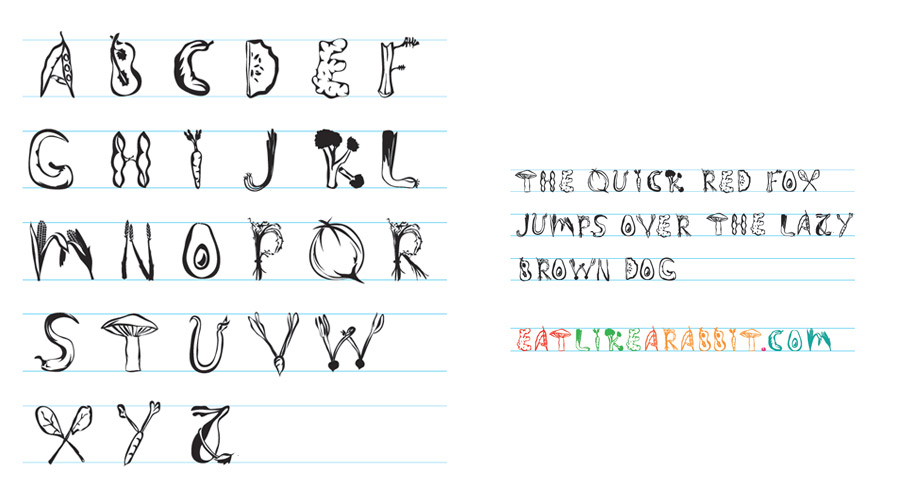
VegOut Typeface
Typeface, 2009Niche fonts can be tastless—but VegOut is an exception. It was created to bring heaping cups of flavor to what might otherwise be bland design. Each letter is well-balanced, providing an even tonal quality to the page when used in series. It has enough zest to be used to spice up a wilting page or to inspire a logo type.
The typeface uses only vegetables and legumes to create the letter forms. Currently only 1 uppercase set is available.
VegOut Typeface
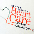
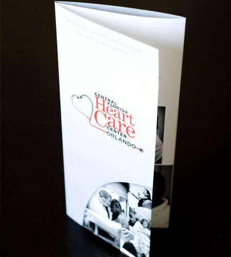
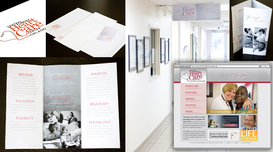
Heart Care Center of CFL
Branding and Collaterals, 2009The clinic provides services to uninsured cardiac patients. Two goals set with staff outlined a need for a brochure for doctors to distribute to potential patients and a method to generate community awareness to educate potential volunteers and sponsors. In addition to the research and collection of all existing materials and documents, two photo shoots provided for an accurate visual and information portrayal of the clinic. The clinics most urgent design piece was a brochure for at-risk patients as they are identified through the local doctors offices and in the hospital.
The logo design brainstorming was the foundation and basis for all the supporting works elements to the project. The clients were involved in the process as their approval was necessary to complete branding.
The brochure was created in two colors to be printed affordably. The design works to balance the bilingual nature of the piece but also illustrate the care and compassion of the clinic. It uses original photography to comfort and welcome patients as well as potential donors. A simple website was designed to share information with potential donors and community members who might have interest in becoming involved. Interior signage was created to mark entry ways and to replace the hand written markings.
Heart Care Center of CFL
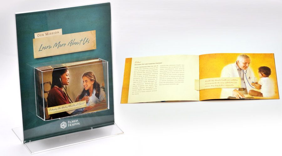
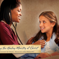
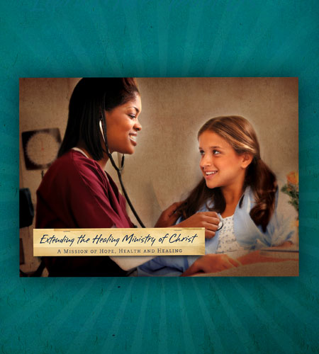
Mission Brochure
Print, 2010This brochure can be found in waiting rooms throughout Adventist Health System. It was created to communicate to hospital guests the grounds by which the hospitals are governed—a Christ-centered, mission-based facility. It explains how the beliefs of the church are integrated into the excellence of care for patients.
The design elements are meant to feel comfortable, simple and warm. The textures and imagery are soft. Repeating elements create easy-to-follow copy blocks and give the reader a relaxed experience as they wait to be served. The size is intentionally small to encourage readers to take it with them.
The display was created to draw focus and win guests attention as they browse for time-passing activities in waiting areas.
Haiti Relief Poster